Planning/ research : Examples of Ancilliary Task 1
Just as it was important to research different music videos to help inspire and guide my A2 video, it is crucial to look into other existing examples of Digipaks for this ancillary tasks to help me gain an idea of what I think works well and what I may want to include in my own work, which I can then fit alongside the audience research I have completed on this as well to give me a strong idea for when completing my own digipak.
Professional examples:
I have decided to look at a variety of professional examples of Digipaks :
Lady Gaga: Fame Monster

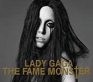
Within this Digipak Lady Gaga's brand is used as a theme, to the point where it is even put onto the CD's themselves. Also, it does not contain any design or art; it is photos of herself which helps project her image. I think this Digipak is effective as it shows the brand of the album and the artist very clearly by have such simplistic images and typography, meaning that is the main attraction for purchasing the album. However I think this only works because Lady Gaga already has a large following who are willing to buy into her brand so that is what sells, if it was smaller brand this tactic make not be so effective. I like the layout of the front of the Digipak and I also like how it looks in black and white, which is something I am going to consider for my own coursework.
Arctic Monkeys : AM

This album cover is very simplistic, being black and white as a theme and only really having the image on the front cover throughout, apart from one image of the band on the inside. I think this is effective as it gives the album itself an image, not just the band, by using a piece of artwork to dictate the main images of the Digipak. Its simplicity looks really smooth and classy, and gives you an impression of what the music is going to be like. The image gives the band an identity, but the fact it is not on the front cover allows the focus to be more on the music than the band and its brand. I like the effect of this digipak and would like to include the simple style within my own coursework as I think it is powerful and would help entice the audience to purchase the audience.
The Hoosiers : Thick to life
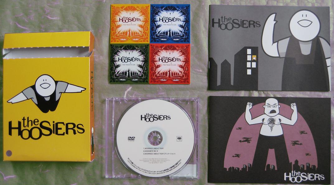
This the the Digipak for the band whose song I am using to make my music video to. They have used simple typography to show the band name, and the same font is used throughout the casing, onto the CD which adds a sense of continuity to their product. They seem to use simple artwork as their covers, with a very simple colour scheme, only using one main colour in the background, without any shading. This makes the album cover bold and eye catching for the consumer, making them more likely to pick up and purchase their product. I think this casing is very effective as it is simple but aesthetically pleasing, and the slight comic effect of the design gives the consumer an idea of what their music might be like ; slightly more upbeat. I would like to make something slightly different for my interpretation of their music to make my own cover more original, as I would like to include some actual photography to give the band more of an identity within the digipak so the audience have more of an insight into whose music they are purchasing.
Student made examples:
I am now going to look at some of the student made examples to give me an idea what other people of my level include within this task.
Owen Smith:


This student has used their own artwork and design when constructing their Digipak. I think this is effective as they simple but effective colour scheme that is likely to attract the consumers attention to make them pick up the album as a potential purchase. They have used a similar design throughout which adds a strong sense of continuity and makes the item appear very professional. They also only use one small bit of writing, which almost has more power through its simplicity as it brings all the attention to 'the woods' as it is the only information the consumer is given, making it enigmatic and tying in with the simplicity of the rest of the cover. I really like this design as I think it is very effective due to its aesthetic.
James Huxtable :

This student has also used artwork to create their album cover but has used a more handmade approach, which has ended up with a beautiful and authentic result. The same imagery is used throughout which adds to the continuity of the product. It has a lot of different designs within the one product, which adds to the vibrancy of the album but when working on my own coursework I would prefer to stick to a more simple design as I think it is easy to overcrowd a cover with lots of complicated artwork. However, I think in this case it shows the essence of the bands music very well and in an aesthetic way, and the way the typography is handwritten gives the cover a more personal feel which is effective in attracting a consumer to purchase the product as it makes it feel more individual.
Hannah Laws:

This digipak is quite contrasting, with the colour schemes from the cover to the inside being so different. This creates a cool effect and makes the product more ambiguous as it is harder for the consumer to know what style the album will be; however within my own coursework I would like more continuity as I think that adds a brand for the band and the album that is easier to market overall. I like the images used, I think they are original and add a sense of character to the album which is quirky yet mysterious, and I would like to use my own photography in a similar way within my own work.
Over all, I have found out that I prefer the simpler styles of digipak, that have some sort of theme or continuity throughout to create more of a brand and this is what I would like to try and create with my own coursework. I would also like to include my own photography.
Professional examples:
I have decided to look at a variety of professional examples of Digipaks :
Lady Gaga: Fame Monster
Within this Digipak Lady Gaga's brand is used as a theme, to the point where it is even put onto the CD's themselves. Also, it does not contain any design or art; it is photos of herself which helps project her image. I think this Digipak is effective as it shows the brand of the album and the artist very clearly by have such simplistic images and typography, meaning that is the main attraction for purchasing the album. However I think this only works because Lady Gaga already has a large following who are willing to buy into her brand so that is what sells, if it was smaller brand this tactic make not be so effective. I like the layout of the front of the Digipak and I also like how it looks in black and white, which is something I am going to consider for my own coursework.
Arctic Monkeys : AM
This album cover is very simplistic, being black and white as a theme and only really having the image on the front cover throughout, apart from one image of the band on the inside. I think this is effective as it gives the album itself an image, not just the band, by using a piece of artwork to dictate the main images of the Digipak. Its simplicity looks really smooth and classy, and gives you an impression of what the music is going to be like. The image gives the band an identity, but the fact it is not on the front cover allows the focus to be more on the music than the band and its brand. I like the effect of this digipak and would like to include the simple style within my own coursework as I think it is powerful and would help entice the audience to purchase the audience.
The Hoosiers : Thick to life
This the the Digipak for the band whose song I am using to make my music video to. They have used simple typography to show the band name, and the same font is used throughout the casing, onto the CD which adds a sense of continuity to their product. They seem to use simple artwork as their covers, with a very simple colour scheme, only using one main colour in the background, without any shading. This makes the album cover bold and eye catching for the consumer, making them more likely to pick up and purchase their product. I think this casing is very effective as it is simple but aesthetically pleasing, and the slight comic effect of the design gives the consumer an idea of what their music might be like ; slightly more upbeat. I would like to make something slightly different for my interpretation of their music to make my own cover more original, as I would like to include some actual photography to give the band more of an identity within the digipak so the audience have more of an insight into whose music they are purchasing.
Student made examples:
I am now going to look at some of the student made examples to give me an idea what other people of my level include within this task.
Owen Smith:
This student has used their own artwork and design when constructing their Digipak. I think this is effective as they simple but effective colour scheme that is likely to attract the consumers attention to make them pick up the album as a potential purchase. They have used a similar design throughout which adds a strong sense of continuity and makes the item appear very professional. They also only use one small bit of writing, which almost has more power through its simplicity as it brings all the attention to 'the woods' as it is the only information the consumer is given, making it enigmatic and tying in with the simplicity of the rest of the cover. I really like this design as I think it is very effective due to its aesthetic.
James Huxtable :
This student has also used artwork to create their album cover but has used a more handmade approach, which has ended up with a beautiful and authentic result. The same imagery is used throughout which adds to the continuity of the product. It has a lot of different designs within the one product, which adds to the vibrancy of the album but when working on my own coursework I would prefer to stick to a more simple design as I think it is easy to overcrowd a cover with lots of complicated artwork. However, I think in this case it shows the essence of the bands music very well and in an aesthetic way, and the way the typography is handwritten gives the cover a more personal feel which is effective in attracting a consumer to purchase the product as it makes it feel more individual.
Hannah Laws:
This digipak is quite contrasting, with the colour schemes from the cover to the inside being so different. This creates a cool effect and makes the product more ambiguous as it is harder for the consumer to know what style the album will be; however within my own coursework I would like more continuity as I think that adds a brand for the band and the album that is easier to market overall. I like the images used, I think they are original and add a sense of character to the album which is quirky yet mysterious, and I would like to use my own photography in a similar way within my own work.
Over all, I have found out that I prefer the simpler styles of digipak, that have some sort of theme or continuity throughout to create more of a brand and this is what I would like to try and create with my own coursework. I would also like to include my own photography.

Comments
Post a Comment